The secret of color in the interior.

When deciding on the interior, you need to choose the right color design depending on the size, functions of the room, the proportions of the walls, ceiling, and personal preferences. Color in the interior creates the right mood and allows you to solve many practical problems. Knowing the basic principles of how color works, you can make the space as comfortable as possible.
All colors in the world are conditionally divided by temperature. The proper color combination selection allows you to achieve extraordinary optical effects. Making your space visually more spacious, raise or lower the ceiling, make your room's climate warmer, more comfortable, or, on the contrary, more ascetic.
The correct selection of colors that mix well will answer the questions: how to get the perfect color, how to combine shades, which colors match each other, and what is the best contrast?
The color scheme is known to affect mood. Warm shades of colors in the interior stimulate relaxation, make the room cozier, and add optimism; very vivid tones are sometimes considered aggressive.

Ecru - a combination of white with shades of yellow and gray. It is a natural shade of linen, cotton, sand, beige, cream, and creamy white. Ecru gently but effectively reflects light. Due to the neutral tone, it is easy to match beige with other colors. Ecru is good in the living room, bedroom, bathroom, and kitchen.

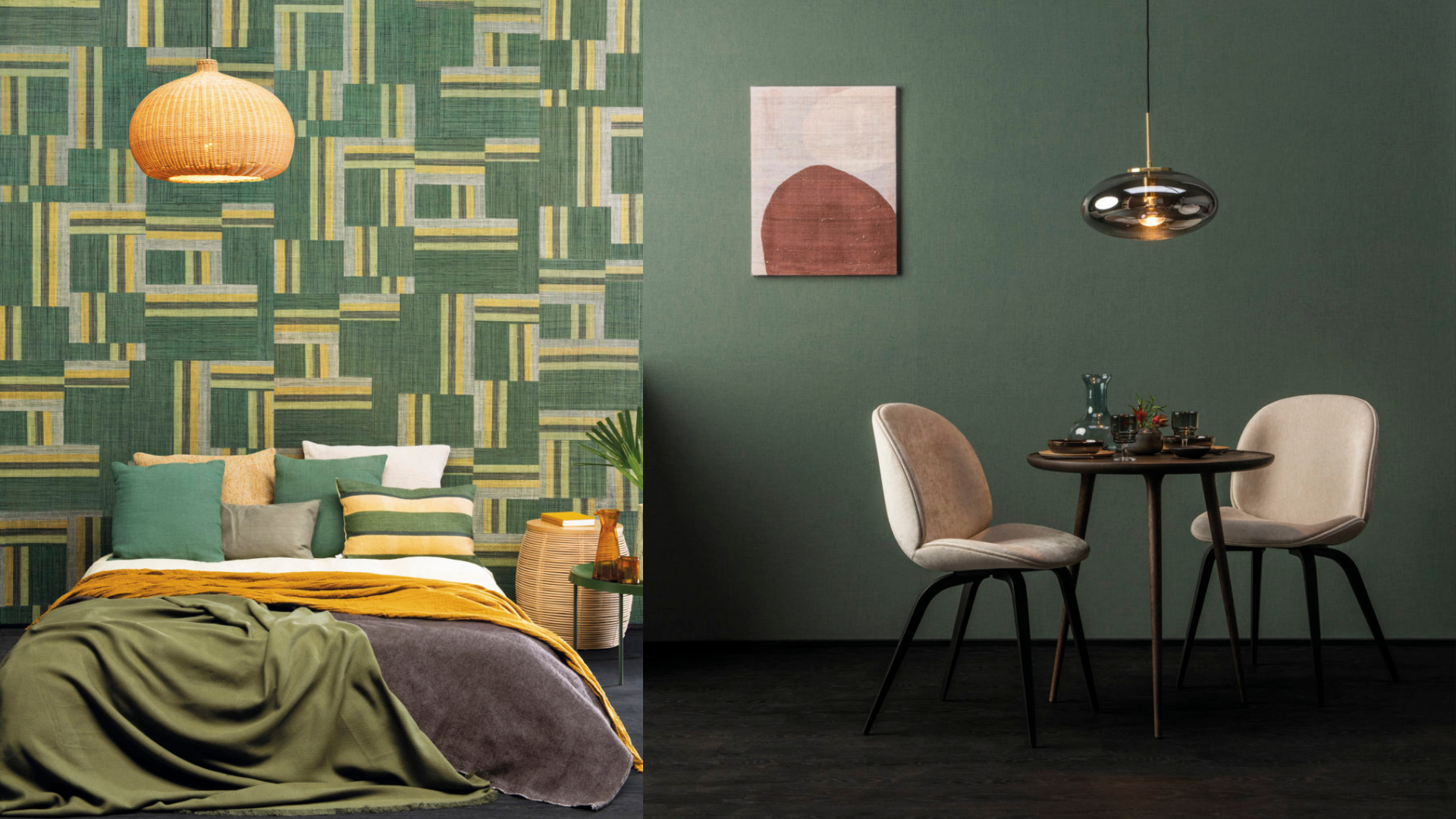
Earth colors palette includes brown, linen, beige, olive, gray, and yellowish-green. Such tones are quiet, natural, and help relax and are recommended for any room and will match all styles.

Yellow colors will add positive energy to your space. Stimulating creativity, encouraging action, creating comfort, and adding optimism. There are many different shades of yellow: lemon, honey, mustard, pineapple, butter, linen, amber, and gold.

Orange colors stimulate fun moods and symbolize fire - a symbol of warmth and comfort. The combination of orange, brick terracotta, and rust works in rooms where you spend leisure time with family and loved ones.

Dark red, scarlet, ruby, burgundy - juicy shades of love and passion. Red is the hottest of all colors. Red raises blood pressure, warms the atmosphere, lights a fire, is used to decorate romantic dates, stimulates appetite, and spices up the atmosphere.

Cool tones on the color wheel, starting with shades of green (mint, emerald green) and shades of blue and purple. Cold colors soothe, relax, make the room visually more spacious and airy, and optically expand your space. It is recommended for study rooms and offices due to its concentration helping properties. Cold color tones can be used in all rooms and work for countries with hot climates.
The interior's violet color will help you relax after a busy day. Purple looks especially beautiful paired with gray.

The blue color in the bathroom will give a feeling of freshness. Blue looks incredibly harmonious in bathrooms in a marine style, retro style, and shabby chic. Stylish furniture looks beautiful with blue walls and white plumbing.

Green - ideal where work causes eye strain - in offices, home studies, teenagers' rooms. A green wall in front of the table, green curtains, a carpet, and indoor plants will become allies of study. In the children's room, mint and pastel green shades are helpful; it is easier to relax and fall asleep. Bright green helps to create, learn, and stimulate mental activity. Use light colors to decorate small spaces and darker green for larger areas.

Designers do not recommend using more than three different colors in one room. Play on shades and textures of materials and fabrics, but do not overload the interior with too many colors. Otherwise, you can quickly go too far.
At Wall Boutique, we offer free design advice, including help from our interior colorists, when you purchase wallpaper with us.
Leave a comment
Comments will be approved before showing up.